Sales Pages VS. Landing Pages - Which One Do You Need To Use?
Sales pages are a great tool to use when selling online for these reasons:
They help you and your customers understand what it is you are selling:
A sales page can help you create more clarity for yourself AND your people. The process of creating and designing a sales page helps you visually understand your offer in an even deeper way.
they give people a visual reference to help them make a buying decision:
People need to SEE what they are getting when they sign up. By including things like images, screenshots, glam shots, icons, and visual infographics it can help your people make a decision.
If you are just using instagram to promote and launch something you are seriously missing out on sales. I always believe that people learn and process information in different ways.
Not having a sales page leaves out an entire group of people and makes your work less accessible.
By creating a sales page you create more accessibility and make it easier for people to understand what they are getting into!
it gives your business a more professional look and creates more trust:
Beautiful and strategic sales pages work because it creates trust. If someone is spending thousands of dollars, the numbr one importance is looking like a pro and creating trust between you and your audience. A carefully crafted page speaks volumes about how you will deliver!
They help tell the story & transformation your client will go through:
As you flow through a sales page it should tell story and answer any and all of your clients questions
Now that we know what sales pages are great for.. I am sure you are wondering…What is the difference between a landing page, long form sales page, and short form sales page?
In this article I am going to discuss the differences of each one and show you some examples. Ready?
Sales Pages VS. Landing Pages - Which One Do You Need To Use?
A landing page:
A landing page is usually a standalone page that is meant to be the first thing someone lands on when they get to your website! (Not to be confused with a sales page or opt-in page) an opt-in page is a super small page that has a sign up form with one hero section. Usually with minimal information and an enticing title.
A landing page is meant to be used as an entry way or portal into your brand - and usually there is a free offer like a workshop, guidebook, or video series as a way to build your email list and create brand awareness.
Short form sales page
A short form sales page is exactly that, a short page.
Normally this is used for something that the offer or investment is very low or for a smaller product.
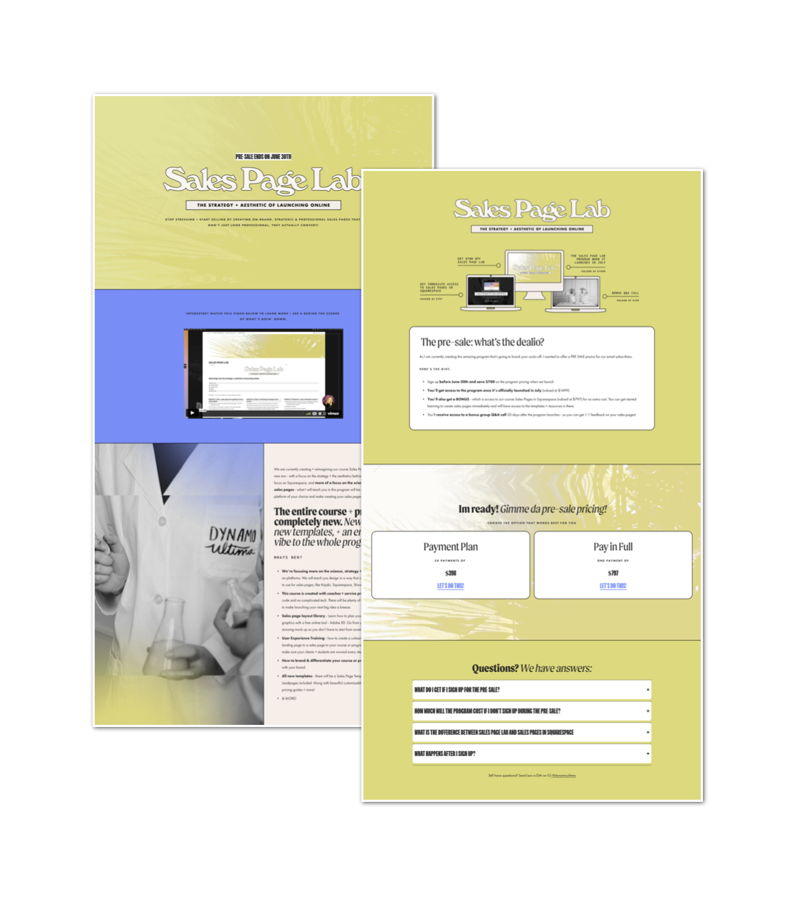
They wont need a lot of convincing to purchase the product, or maybe you are sending the offer to someone who already knows you well and they are considered warm leads. I used this type of sales page for my pre-sale of my course Sales Page Lab.
Long form sales page
A long form sales page is meant to be used for your higher ticket course, product, service, or program!
This likely will be presented to cold leads, aka people who have just discovered you.
Normally you need a longer page if there are multiple things included in your offer.
If there are a lot of parts and pieces and offerings you will need a longer sales page to describe everything it entails and if it is premium pricing, people will really need to know WTF they are buying, what the benefits are and how it’s going to solve thier problems
So there you have it: the steps to creating a successful sales page that will help you launch your next online program or course. We hope this article has been useful to you, and that it helps you get more clients and make more money doing the work you love!


