6 Sales Page Design Secrets For Extra Clarity And Conversion
If you are launching courses, coaching programs or digital products - then you’ll want to make some tweaks to your sales page! In this article I am sharing my 6 sales page design secrets for extra clarity and higher conversion!
Building sales pages is an art and it can be challenging to know what to put where or to understand how design can really influence buying decisions if you’re not an experienced designer.
I’m sharing all of my designer secrets that you can steal from my pro-designer playbook. Are you ready?
Secret #1: Show what’s actually included with glam shots & info cards to explain information in detail:
One very important thing to do with sales pages is to show the potential customer what they get when they sign up or purchase your offer. When you are creating sales pages for your service, program, course.
The actual offer someone is purchasing is a digital product and this does not have a tangible feel because you are not selling a physical item someone will receive like an iPhone. This can create difficulty in understanding the true value of what you are offering.
What I love to do to create more desire, interest and make people feel like they are getting something of value is to create glam shots.
What are glam shots? Glam shots are visual representations of your digital product featuring what is included. Examples of what this looks like below!
I design custom glam shots for every single one of my own and my clients sales pages.
I do this because I understand we place value on a variety of different things, but because what you are selling is not a physical item - it can really make your sales page more effective to create a graphic that makes your offer FEEL tangible which can make it more valuable to the customer.
Digital products NEED to look like they are more than just words on a screen. The best way to do this is to create eye catching glam shots that feature everything included inside your program/course/service offering.
I also like to include a detailed break down of each item included inside of an offer by using info cards underneath the glam shot. You can repurpose your glam shots for these cards and explain in detail what each item means.
An example of how I have done this below:
Secret #2: Highlight exactly who it’s for:
Another great way to make sure your offer is clear is to highlight exactly who your offer is for! You can do this by:
Listing out their current situation of where they are at - often known as pain points.
Sharing about where they would like to be and helping them imagine their future self or ideal version of themselves. Just imagine if…. painting the picture in their head of the dream next level.
Creating a section that says “this is for you if” “this is not for you if”so they can easily check off boxes on if your offer is right for them
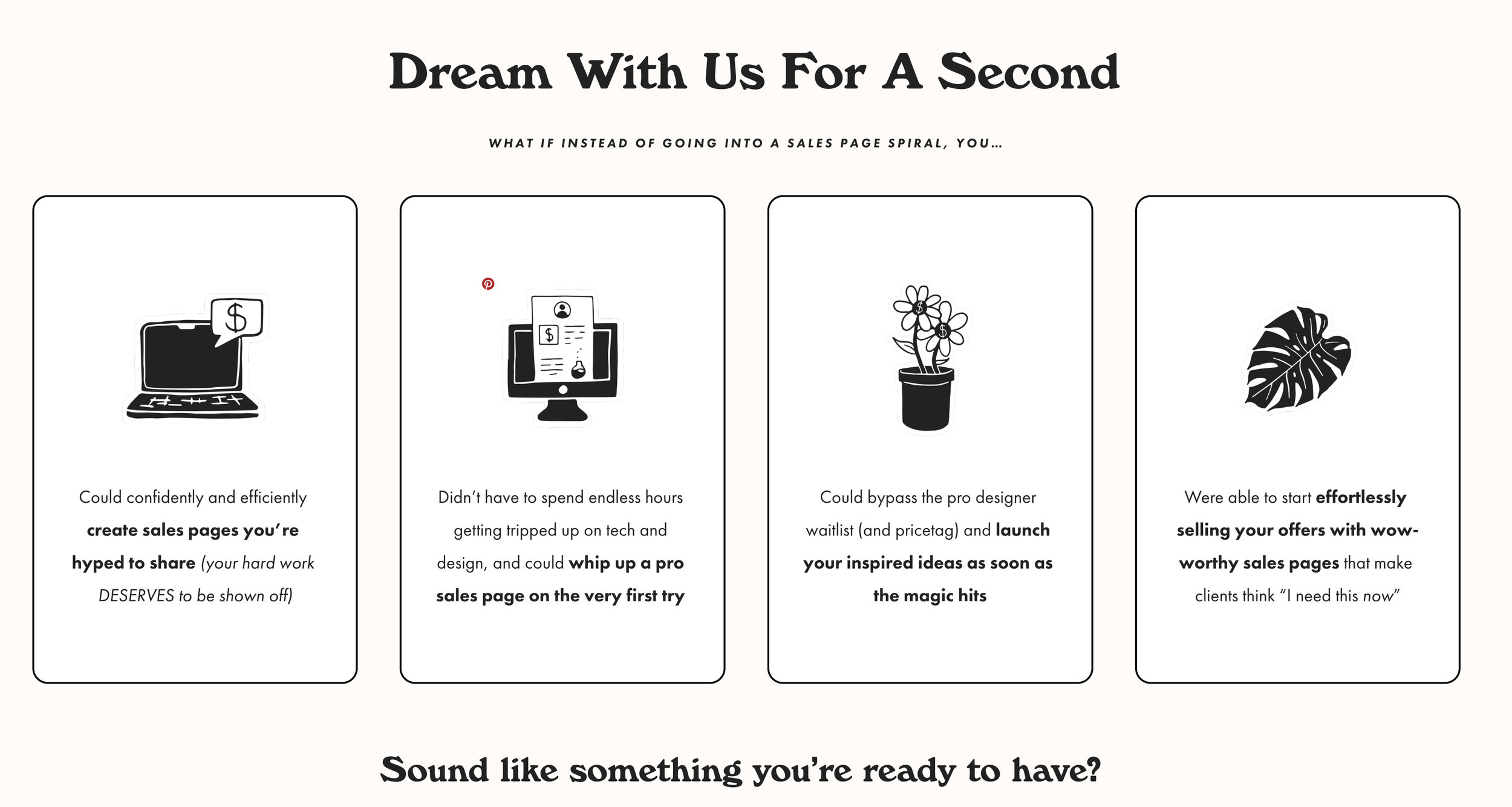
Being very clear and illustrating these few various different ways for them to connect to your offer can help someone make a clear informed decision!
Below are a few examples of what this looks like on a sales page:
Secret #3: Make your copy scannable with hierarchy
The best way to make sure you keep someones attention span on any sales page, sales email, or copy is to make it scannable.
What do I mean by scannable? It basically means that someone can easily scan your page to completely understand it without needing to read every single paragraph of copy.
How can you make your copy scannable?
Hierarchy
Using Heading 1, Heading 2, Heading 3, body copy, bolding text, underlining text to highlight the order of which copy you’d like someone to read first, second and third.
Info cards
Instead of having all of your copy in large blocks of paragraphs explaining everything, try to write your copy in chunks. When you do this, you can easily create info cards for your sales pages that are easier to scan than just text paragraphs.
Bullet points and lists
Using lists or bullet points is much easier to read than longer paragraphs. Try to avoid adding TOO many items in your list, sticking with under 7 items is best. It’s also best to make sure you keep your text in your bullet pointed list as short as possible to ensure easy reading.
Like this example from How To Work Less below!
Short paragraphs
Keep your paragraphs to 4-5 lines or less! This makes it so much easier to read a body of text than a super long paragraph. People will likely run a million miles away if they see huge chunks of text.
Keeping them short and concise really is the best move for your copy!
Secret #4 Use contrast between your sections + organize your copy in a way that flows through each question
Using contrast between each section of your sales page can help your potential customers read through and understand your sales page even better. Creating breaks between shifting content and sections of your sales page with color can really help with your conversions.
Here is an example:
Make sure to be consistent with the section colors you choose for your sales pages!
For example you could use a very bright colored background for the header hero of the sales page, and then investment areas. Or you could use the same color background for all of your testimonials.
Creating some sort of order using color can make the page flow together much better.
Secret #5: Make your CTA buttons bright + fun!
Your sales page needs multiple call to action buttons on the page!
**If you are using Squarespace and you need to link your buttons to the investment section on your sales page you will need to add anchor links to your sales page. Here is an article on Squarespace on how to add anchor links to a different section on your sales page.
Making sure all of your buttons are a bright color and super easy to see on the page is important for more conversions.
Sometimes people wont even want to look at the sales page or wont need to go all the way down to the bottom to make a decision. Give them multiple opportunities to make a decision to enroll for your offer throughout your sales page.
Another great thing to add is instead of writing “click here” or “i’m in” you’ll want to strategically make your buttons more engaging! For example making sure the button makes sense with the copy on the section.
Copy on section: Just imagine if your life could be filled with magical unicorns and rainbows?
Copy on CTA button “I’m ready for the magic”
See how much better that sounds than click here or enroll now?
Secret #6 Remove the header and footer from your sales page
Your sales page should be tailored to meet one goal and one goal only which is converting!
A huge mistake I see people making is keeping their website’s footer and header navigation links right on their sales page.
This is very distracting from your goal and it does not make sense to include them on your sales page. If you have links to your other site pages, people will end up clicking around and exiting your sales page which defeats the one purpose of the page.
For my clients, I like to add a “sales page footer” that includes the course or program logo, social media links, and a link to the terms & important details pertaining to the program.
You can also add a link back to your website to make it easy for someone to be able to view your other products and services.
Need help? Here’s a quick video on how to do this on your Squarespace site.
So there you have it: 6 sales page design secrets for extra clarity & conversion. We hope this article has been useful to you, and that it helps you get more clients and make more money doing the work you love!


